Halcyon docs
Everything you need to build a hub, in reading order. Each part links to the full reference on GitHub when there's more to say.
Getting started
Load the library, make a window, add a tab, a section and some controls. Call LoadAutoload last so a saved config can restore everything you built.
local Halcyon = loadstring(game:HttpGet("https://raw.githubusercontent.com/ScriptsForDays/Halcyon/main/dist/Halcyon.luau"))()

local Window = Halcyon:CreateWindow({ Title = "My Hub", Icon = "gamepad-2", Folder = "MyHub" })
if not Window then return end -- only needed with a KeySystem

local Player = Window:Tab({ Title = "Player", Icon = "user" })
local Movement = Player:Section({ Title = "Movement", Icon = "footprints" })

Movement:Toggle({ Title = "Fly", Flag = "Fly", Callback = function(on) end })
Movement:Slider({ Title = "Walk speed", Min = 16, Max = 120, Default = 32, Flag = "WalkSpeed" })

Window:SettingsTab()
Window.OnUnload:Connect(function() -- undo what the hub changed end)
Window:LoadAutoload()In Roblox Studio, insert dist/Halcyon.rbxmx into ReplicatedStorage and require it from a LocalScript instead.
Running the same hub twice replaces the first window, as long as Folder stays the same. You don't need your own "already running" check.
Window
Every option is optional. These are the ones most hubs touch:
| Option | What it does |
|---|---|
Title, Subtitle, Icon | Shown in the top bar. Version adds a tag beside the title. |
Folder | Where configs and settings save, and the hub's identity across runs. |
TabStyle | Sidebar, Rail, Top or Dock navigation. Narrow windows use Top. |
Size, Scale | Starting size (always fitted to the screen) and interface scale. |
ToggleKey | The key that shows and hides the window. RightShift by default. |
TopbarImage | A picture before the title, in six shapes with TopbarImageStyle. |
HeaderStyle, Logo | Bar, Tall, Wordmark or Sidebar. Sidebar puts a big logo above the tabs and drops the top bar. |
CommandPalette | true lets Ctrl+K search every tab and setting. |
Profile, KeySystem, UpdateLog | Covered in their own parts below. |
Every built-in part turns on or off with true or false: Search, Profile, Close, Minimize, Resize, Drag, Shadow, Tooltips, Animations, Blur, NotificationCenter, Watermark, KeybindList, SettingsTab and more. Window:Set("Search", false) flips one while the hub runs.
local Window = Halcyon:CreateWindow({
	Title = "My Hub",
	HeaderStyle = "Sidebar",
	Close = false,
	NotificationCenter = true,
})
Window:Set("Search", false)The window also has Notify, Dialog, SetEnabled (grey every control), AddTopbarButton, Sheet (a side panel), QuickBar (a floating bar that stays when the window hides) and Unload. The full list is in the API reference.
Tabs and sections
A tab is a page; a section is a titled box of rows on it. Wide windows show two columns, and Side = "Right" puts a section in the second. On a phone everything stacks in the order you wrote it.
local Combat = Window:Tab({ Title = "Combat", Icon = "swords", Group = "Features" })
local Aim = Combat:Section({ Title = "Aim", Tabs = { "Players", "NPCs" } })
Aim:Tab("NPCs"):Toggle({ Title = "Target bosses first" })

local Farm = Combat:Section({ Title = "Auto farm", Switch = { Default = false, Flag = "Farm" }, Side = "Right" })- Tabs inside a section (
Tabs) keep parallel settings together. - A header switch (
Switch) greys every row in the section while it's off. ShowWhenon any row or section shows it only while another control has a value, so tuning options appear only when they apply.EnableWhengreys it instead, andVisible = falseorDisabled = truework on tabs, sections and rows.Section:Group()puts two or three short controls on one line.- Locks:
TierorPaidOnlyon a tab, section or row keeps it visible but locked, with your own wording.
Controls
Every control takes one table of options and returns a handle with Get, Set and Changed. Set always runs the Callback; creating a control doesn't, except a Toggle that starts on.
| Control | Use it for |
|---|---|
Toggle | A feature that stays on or off. Can carry its own keybind and colour. |
Button, Buttons | Something that happens now. Hold-to-confirm, press-twice and loading states. |
Slider | A number in a known range, with a typed value box, prefix, percent or range. |
Segmented, Radio | One of a few options, all visible. |
Dropdown | One or several of many: icons, headings, searchable, or the server's players. |
Checklist, Chips, Tiles | Several picks of one kind, as rows, pills or icon cards. |
Input | Free text or an unbounded number. Password, multi-line, counter, clear. |
Keybind, ColorPicker, DatePicker | A key, a colour or a date the player chooses. |
Stepper, Rating | Small exact counts and levels. |
Progress, Status, Countdown | State the hub reports: progress, a status pill, time left. |
Table | Sortable rows and columns of data. |
List, Tags | Picks shown in place or dragged into order, and words the player types into chips. |
PlayerList | The server's players, with your own buttons on each row. |
Stat, Stats, Graph, Log | Figures, live charts and a log panel for dashboards. |
MenuButton, Banner, Link | A menu of actions, an announcement card, and an address the player can copy. |
Paragraph, Label, Accordion | Text, callouts and fold-out help. |
Divider, Space, Code, Image | Structure and media. |
Gauge, Knob | A value shown as a ring, and a dial the player turns. |
Chart | Donut, pie, line or bar charts with a legend and hover values. |
ItemGrid | An inventory of cards with rarities, counts, search and sort. |
Waypoints | Places the player saves, renames and teleports back to. |
Viewport | A 3D model or the player's own character, turned by dragging. |
Every control also takes Description, Icon, Flag, Tooltip, Badge, Info, Menu (actions on a right-click or long press) and Requires (lock the row when the executor lacks a function). Options for each control are in the API reference.
Some controls take a little more. A Toggle can share an Exclusive group so only one is on, or ask with Confirm before it turns on. A Keybind with Modifiers = true records Ctrl, Shift and Alt combinations, a Button can carry its own Keybind, and an Input's Validate refuses text with a reason under the box.
Handles also have SetSilent (change the value without running the Callback), Reset and GetDefault. A Callback that errors shows its reason under its row instead of stopping the hub.
Pages, pop-outs, favourites
A sub-page opens from a row on a tab or section, with a breadcrumb and a back arrow; Escape goes back. Pages hold sections like a tab does, and search reaches the rows inside them.
local Aim = Combat:Section({ Title = "Aim", PopOut = true })
local Prediction = Aim:Page({ Title = "Prediction", Description = "How far ahead to aim" })
Prediction:Section({ Title = "Lead" }):Slider({ Title = "Lead time", Flag = "Lead", Min = 0, Max = 1, Step = 0.05 })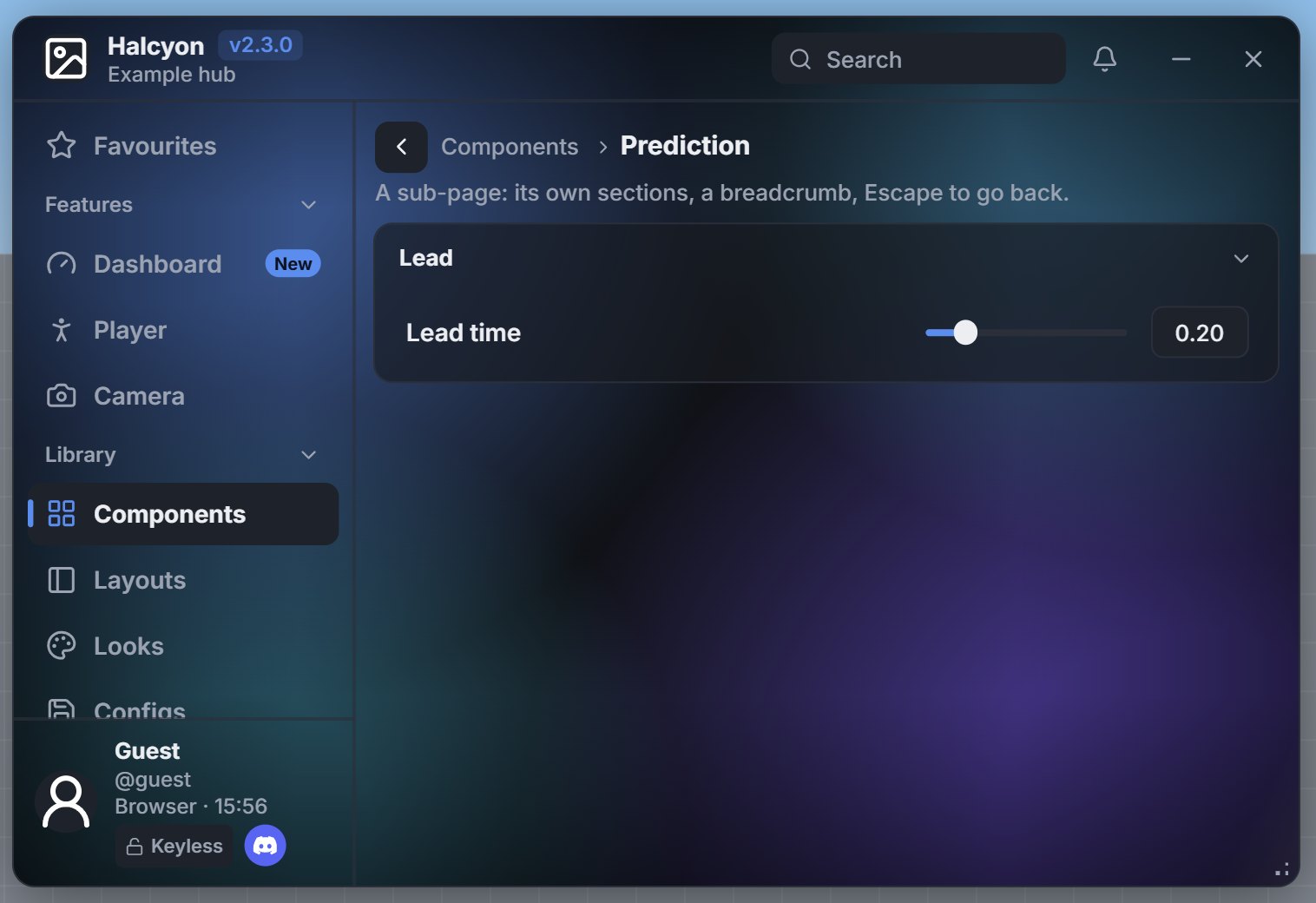
PopOut = true puts a button in the section's header that moves its rows into a floating panel. Drag the panel by its title bar and resize it from the bottom-right corner. It stays on screen while the hub is hidden, so a live readout or a quick switch keeps working over the game. Where it sits and whether it was out are saved.
Favourites = true adds a Favourites tab at the top. Players star a row from its right-click or long-press menu and get a live copy there; changing either one changes both. Favourite = true on a row starts it in the list the first time the hub runs. TabReorder = true lets players drag tabs into their own order and pin them.
Looks and presets
Nothing changes until you opt in. Then you choose how far to go:
-- One control
Section:Toggle({ Title = "Fly", Style = "Slim" })

-- Every control of a kind in this window
Halcyon:CreateWindow({ Title = "Hub", Styles = { Toggle = "Slim", Slider = "Thick" } })

-- A coordinated set: Classic, Minimal, Glass, Neon or Compact
Halcyon:CreateWindow({ Title = "Hub", Preset = "Glass" })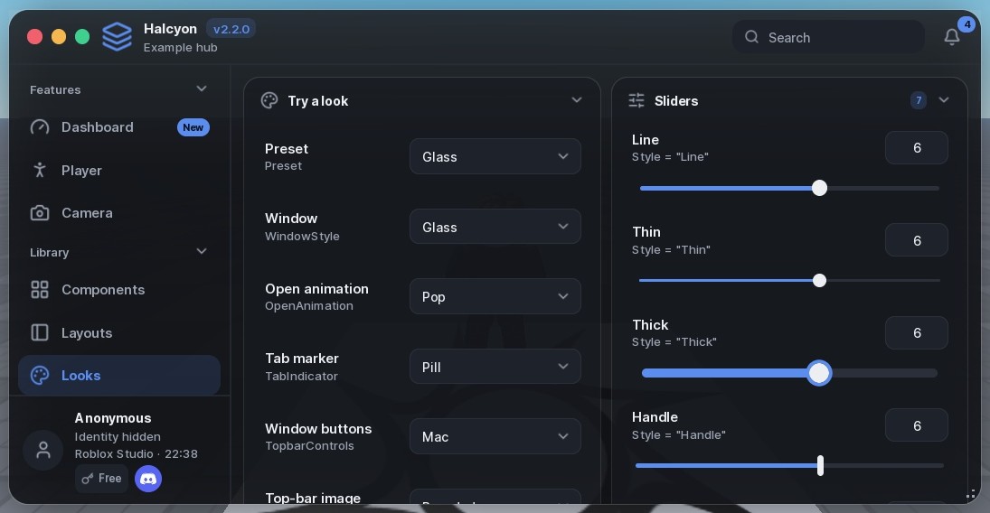
An element's own Style wins over the window's Styles, which win over a preset. The example hub's Looks tab shows every look with the line that turns it on. The complete list is in styles.md.
Moving backgrounds
A background behind the whole window, or inside one section. It moves with tweens, so no script runs every frame, and it stops while the hub or its tab is hidden. With reduced motion it holds still.
Halcyon:CreateWindow({ Title = "Farm", Background = { Kind = "Aurora", Sheen = true } })
Farm:Section({ Title = "Session", Background = { Kind = "Glow", Intensity = 0.55 } })| Key | What it does |
|---|---|
Kind | Aurora, Glow (a light that follows the pointer), Gradient, Mesh, Pattern or Image. |
Colors | Theme roles or Color3 values. By default, the accent and two hues beside it. |
Speed, Intensity | How fast it moves, and how strongly it shows: 0.75 behind the window, 0.3 in a section. |
Sheen | A band of light crosses it every few seconds. |
Vignette | Darker edges. On by default behind the window. |
SeeThrough | How much of a window background shows through the cards, 0 to 0.6. Default 0.35. |
Use one behind the window and at most one or two sections with their own, for the section players should look at first. A popped-out section takes its background into the panel. Window:SetBackground and Section:SetBackground change or remove one while the hub runs.
Themes and personalising
Sixteen themes ship with the library, each keeping text at a contrast of 4.5 or more on every surface. Colours are roles, so switching themes recolours everything already on screen.
Halcyon:SetTheme("Aurora")
Halcyon:AddTheme({ Name = "Mine", Base = "Midnight", accent = Color3.fromRGB(80, 220, 160) })

Window:SettingsTab({ Personalise = true, ThemeBuilder = true })Personalise lets players change font, text size, corners, spacing, window transparency and notice position, live and saved. ThemeBuilder lets them make a theme and share it as text.
Images
Anywhere Halcyon takes an image or icon, it accepts an icon name, an asset id, an https URL or a file in the executor's workspace. URLs download once to Halcyon/assets and show through getcustomasset.
Halcyon:CreateWindow({
	Title = "My Hub",
	TopbarImage = "https://example.com/logo.png",
	TopbarImageStyle = "Squircle", -- Circle, Rounded, Square, Squircle, Ring, Badge
})Images over 5 MB are refused, and files must stay inside the workspace. Where getcustomasset isn't available, such as Roblox Studio, an image icon shows instead.
Key system
Tiers run from lowest to highest. Keyless needs no key, Free is a key earned through your ad link, and Paid unlocks everything. Use your own names if they fit better.
KeySystem = {
	Title = "My Hub access",
	Discord = "https://discord.gg/example",
	Tiers = {
		{ NoKey = true },
		{ Name = "Free", AdService = { Name = "Linkvertise", Link = "https://…", Confirm = function(key) return askYourServer(key) end } },
		{ Name = "Paid", Validate = function(key) return askYourServer(key) end },
	},
}A key prompt in a client script is a gate for honest players, not security. Check keys on your own server and keep anything valuable there.
More in key-system.md.
Profile and Discord
The profile card shows the player's avatar, name, tier, executor and clock, with an anonymous mode. Profile = false hides it.
Profile = { ShowClock = true, Discord = "https://discord.gg/example" }The Discord button on the profile is separate from the one on the key prompt; set either, both or neither. A press opens the invite in the Discord app when it's running; otherwise it copies the link. Either way the player is told which.
Notices and dialogs
Window:Notify({ Title = "Config saved", Kind = "success", Style = "Compact" })

local job = Window:Notify({ Title = "Downloading", Style = "Progress" })
job.SetProgress(0.5)
job.Done("Downloaded")

Window:Dialog({
	Title = "Delete this config?",
	Buttons = { { Title = "Keep" }, { Title = "Delete", Variant = "Danger", Delay = 3 } },
})Notices come in ten styles. They pause while hovered and swipe away, and NotificationCenter = true keeps the last 50 behind a bell in the top bar. Send them for results players can't see (saved, failed, finished), not for every toggle; the switch moving is feedback enough.
Window:Notify({ Title = "Config saved", Kind = "success", Countdown = "Edge" })

-- The same Id updates the notice on screen instead of adding another
Window:Notify({ Id = "farm", Title = "Farming", Content = coins .. " coins", Duration = 0 })

Halcyon:SetNotificationDefaults({ Countdown = "Ring", Stack = "Deck" })Countdown is Bar, Edge (the outline drains back to the top centre), Ring, Top or None. Identical notices fold into one card with a count unless Merge = false. Stack = "Deck" piles them and fans them out on hover. Notices also take Image, OnClick and OnDismiss.
Update log
UpdateLog = true adds a tab of releases, newest first, with changes grouped by kind, search, filters and a badge until the player has seen the newest.
UpdateLog = {
	Popup = true, -- show the newest once as a what's-new card
	Updates = {
		{ Version = "1.2.0", Date = "12 Nov 2026", Title = "Auto farm", Entries = {
			{ Kind = "New", Text = "Auto farm for the mines" },
			{ Kind = "Fixed", Text = "Teleports after respawn" },
		} },
	},
}

Window:AddUpdate({ Version = "1.2.1", Entries = { { Kind = "Fixed", Text = "Crash on join" } } })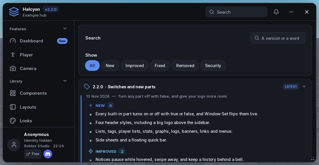
Kinds are New, Improved, Fixed, Removed and Security. Versions sort by number, so 1.10 comes after 1.9. UpdateLog = false builds nothing.
UpdateCheck = { Url = "..." } reads a version number from your own address a moment after the hub opens and tells players when a newer one is out. It never runs what it downloads. For bug reports, Window:SupportPanel() lists what the player's executor can do and which rows are locked for it, and Window:ErrorsPanel() lists failed callbacks with tracebacks. Both are rows in the Settings tab too.
Panels
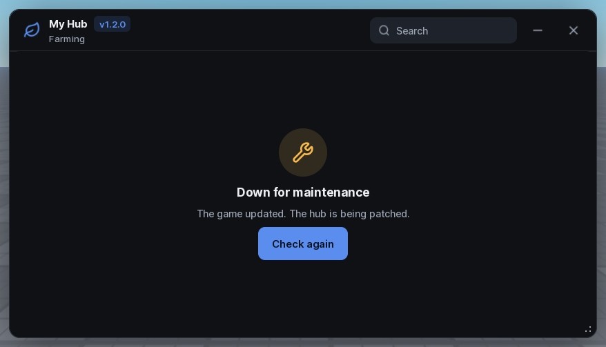
Window:Loading()covers the window during setup and moves only as you callSetProgress.Window:Changelog()shows a what's-new card once per version.Tab:EmptyState()fills a tab whose content isn't ready, or failed to load.Window:Lock()andUnlock()block the hub for maintenance or a required update.Tab:About()lists credits and links the player can copy.
Configs and saving
A config holds the value of every control with a Flag. The Settings tab includes a config section, or place one anywhere with Window:ConfigSection(tab).
Loading a config runs each flagged Callback, so give Flags to settings worth restoring, not to toggles that start something risky. The player's interface choices save on their own to Halcyon/<Folder>/settings.json.
Window:ExportConfig() turns every setting into one line of text that another player can paste with ImportConfig; this needs no file access. Loading, importing or resetting can be taken back with Window:Undo(); from the config rows, the notice that follows has an Undo button. With Configs = { PerGame = "Place" } (or "Universe"), each game keeps its own configs and autoload.
Languages
Halcyon's own words (buttons, prompts, the Settings tab) come in nine languages: English, Brazilian Portuguese, Spanish, Vietnamese, Indonesian, Russian, Turkish, French and German. Language = "auto" follows the player's Roblox language, and the Settings tab lets them pick. Your own titles stay as you wrote them.
Halcyon:CreateWindow({ Title = "Farm", Language = "auto", Strings = { ["Save"] = "Keep" } })Strings replaces any built-in wording with your own. The translations are short and open to fixes from native speakers.
Extending Halcyon
Debug = truewarns about option names Halcyon doesn't know, with a guess at the one you meant, and about misspelt looks and themes.Halcyon:Build(spec)makes a whole hub from one table and returns its controls by Flag or Id. A mistake names its place in the table.Halcyon:RegisterElement(kind, definition)adds your own control. It gets flags, configs, locks, search andShowWhenlike the built-in ones.dist/Halcyon.types.luaugives luau-lsp and Studio's editor the type of every option and method.
local Window, controls = Halcyon:Build({
	Window = { Title = "Farm", Folder = "Farm", Debug = true },
	Tabs = {
		{ Title = "Farm", Sections = {
			{ Title = "Auto", Elements = {
				{ "Toggle", Title = "Auto farm", Flag = "AutoFarm" },
				{ "Slider", Title = "Range", Flag = "Range", Min = 10, Max = 200, Default = 80 },
			} },
		} },
	},
	SettingsTab = true,
})For AI assistants
If you build hubs with an AI assistant, give it two files:
- LLM.txt lists every component in the same shape: what it's for, when not to use it, its options, its looks and common mistakes.
- llm-guide.md explains how to pick controls, how much to put on a tab and what to leave out, with the reasons.
https://raw.githubusercontent.com/ScriptsForDays/Halcyon/main/LLM.txtChangelog
2.3.0
- The resize grip keeps the window's corner under the pointer wherever the window sits.
- Sub-pages, pop-out sections, favourites and tabs players can drag into order.
- Gauge, Knob, Chart, ItemGrid, Waypoints and Viewport.
- Notices that count down around their border, update in place by
Idand fold repeats together. - Moving backgrounds for the window and sections.
- Search marks the matched words and steps through every match.
- Share codes, undo, per-game configs, nine languages, an update check, and support and errors panels.
Debug,Halcyon:Build,RegisterElementand Luau types.
2.2.0
- Every built-in part turns on or off with
trueorfalse, andWindow:Setflips them live. - Header styles, including a big logo above the sidebar.
- List, Tags, PlayerList, MenuButton, Stat, Graph, Log, Banner and Link, plus row menus, sheets and a quick bar.
- Notices with a full-height accent edge, hover pause, swipe to dismiss and a history behind a bell.
- Shorter labels throughout, and a playable demo on this site.
2.1.0
- Images from a URL or workspace file anywhere the UI takes one, through
getcustomasset. TopbarImagein six shapes.- Discord buttons for the key prompt and the profile card.
UpdateLog, a tab of releases with search, filters and an unseen badge.
2.0.0
- Named looks for every control, and five presets.
- Twelve new controls, including Radio, Tiles, Table and DatePicker.
- Window looks, open animations, tab markers and tabs inside sections.
- Tooltips, spotlights, five more notice styles and Ctrl+K search.
- Six more themes, live personalising and a theme builder.
- Loading, what's-new, empty-state and lock panels.
1.0.0
First release. The full history is in CHANGELOG.md.